
OwnTracks and my Google Timeline
A while back, a friend showed me an application they had started using called OwnTracks, which periodically sends location updates from your phone to your own server. I used to collect similar location data back in the day via Google Latitude, so the idea of self-hosting my own tracking history intrigued me. Fast forward a few months, and I finally got around to setting it up.
Shortly after, another friend decided to set it up as well and mentioned wanting to import their historical Google Timeline exports into it. I hadn’t even considered that, but I loved the idea of giving it a shot since I had years of location data sitting around. A day or two later, I had my data fully ingested and viewable in OwnTracks, dating all the way back to mid-2010.
The first hurdle I ran into was that iOS Google Maps exports use a different format than the Android versions, requiring me to patch the import script to handle the iOS payload. Using an LLM coding assistant, I threw some sample data at it, and it quickly generated everything OwnTracks needed to ingest the files.
However, I quickly discovered that Google Maps on iOS logs far less granular data than it does on Android. Thankfully, I still had my old Android phone from when Google originally moved Timeline data on-device. That phone contained my complete, detailed history from my Android years up until my switch to iPhone, so I dutifully ingested that data too.
The next issue I ran into is that the built in map from the OwnTracks recorder, and even using the OwnTracks frontend was horribly laggy, even with just a years worth of data and I really wanted to see all my data on a map, all at once. Armed with my LLM, I thought It’d be pretty trivial to prompt something into existence that queries the OwnTracks recorder API and plot it all onto a map. I’d originally planned to create something I could use to entirely replace OwnTrack’s own frontend, so that’s where I started. It pretty quickly spiralled though, and it got way more complicated than I’d initially expected.
Most of this was striving to create something that could be suitable for people other than myself. After about a week or so of on-and-off prompting, I’d ended up with something that loads all my data, allows reasonably robust configuration of its appearance and probably too many tuning options. I am however pretty happy with the result even if its code is probably hot garbage.
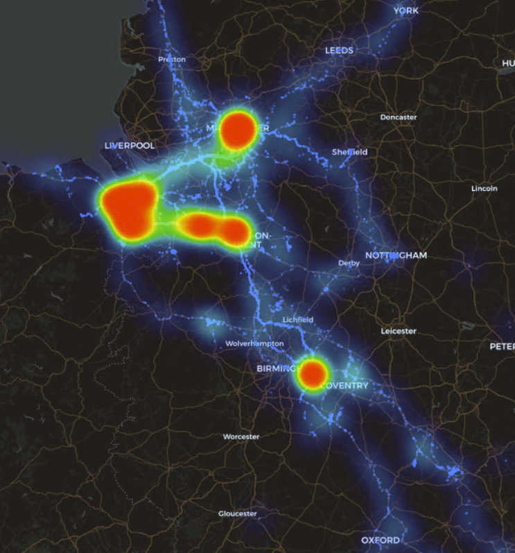
It allows me to view all of my data, panning and scrolling (mostly) without lag, and lets me ultimately view everything all at once. What I find more interesting though, and mainly what I wanted to visualize are the heat maps - I’m not going to post my current or previous address in detail, but you can clearly see my home, my sister’s, the local shop I visited a lot, my mum’s and amusingly, the petrol station I used to frequent. This image shows at a high level, where I live, where I used to live, my old commute, and a giant hot spot near Birmingham for the many years I attended Insomnia Gaming Festival (rip) at the NEC.
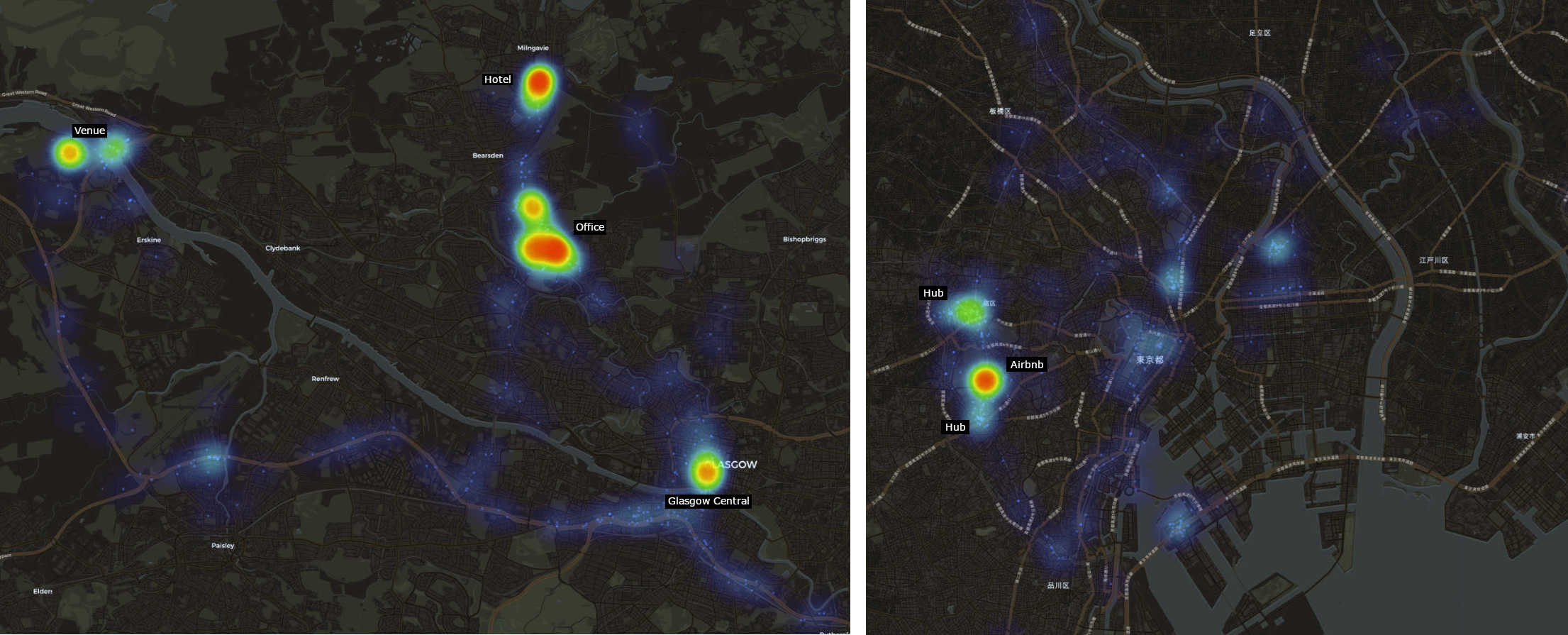
Exploring the data further, clearly shows the kind of hot spots I wanted to see. When I visited Glasgow for work, there’s a hotspot for Glasgow Central, my old office and the hotel they put me up in when I visited, along with the venue of our annual Christmas party. I also took a look at my 2015 trip to Japan, and the Airbnb I stayed at is clearly visible, along with the two major transit hubs I used to get around.
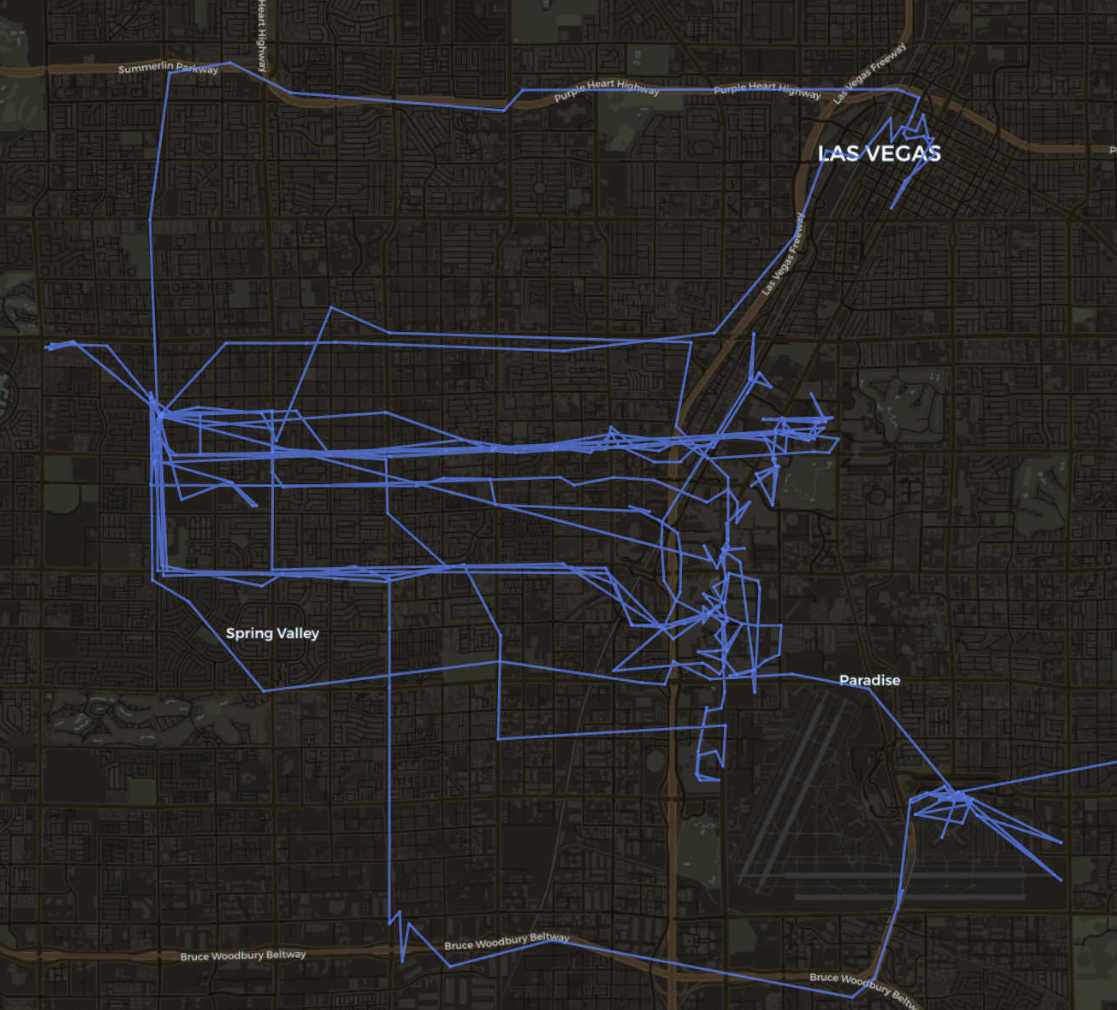
Similarly for my trip to TwitchCon in Las Vegas back in 2023, but instead of a heat map, you can see route lines centered around my Airbnb, the strip, the airport and Fremont Street.
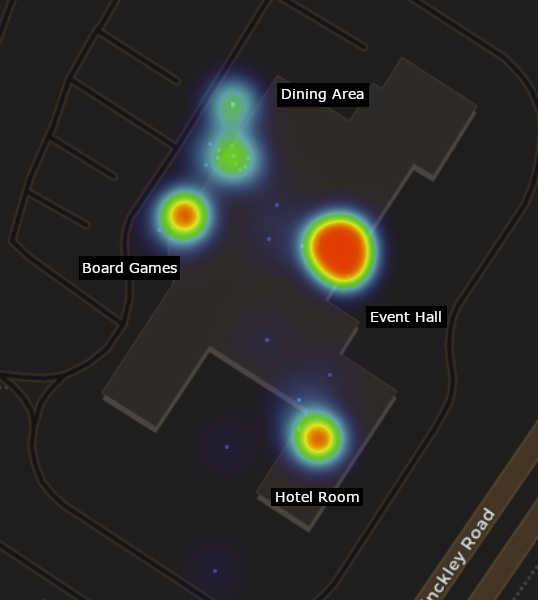
And finally - I attended an EPIC LUX LAN event recently too, and using OwnTrack’s data instead of Google Timeline, I was amused at the granularity. You can see the 4 main areas I spent my time in whilst at the event - The main event hall, my hotel room, the dining area, and in the lobby playing board games with friends!
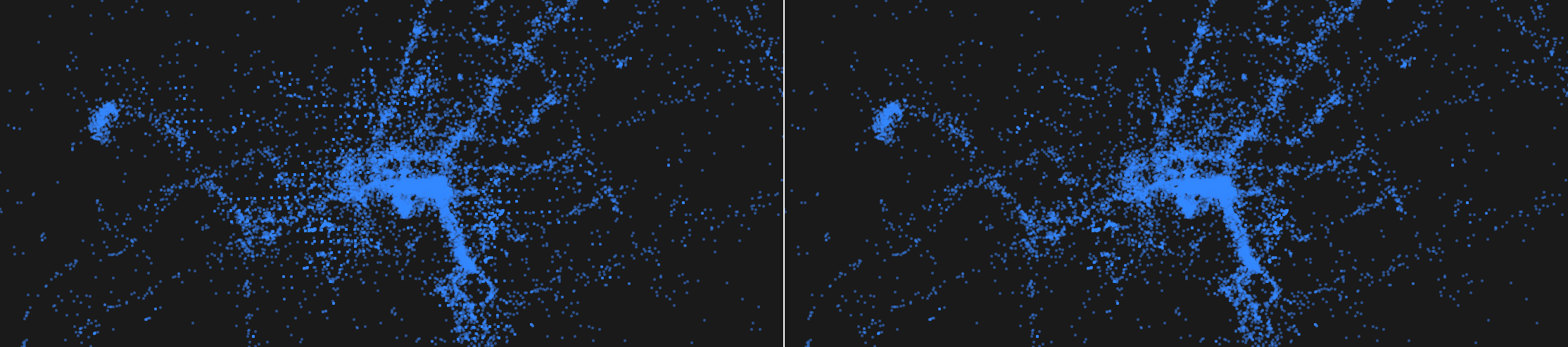
One interesting observation after importing the Google data were strange little artifacts that are displayed on the map. Upon further investigation (mainly by Chris - chameth.com), the grid pattern visible turned out to be Google’s own spatial index showing through. Google indexes geography with a system called S2, which divides the Earth into a hierarchy of square-ish cells, each with a fixed, deterministic center point. Level 18 of that hierarchy produces cells about 30 metres across. When Google Timeline “fills in” your location history during stationary periods, it appears to snap those synthesized points to the centers of these cells - so the points don’t scatter like real GPS fixes, they land on a fixed ~30 m lattice that gets reused every time you’re in the same place. Plot them on a map and you see the index itself: repeating rows of dots, tilted slightly because the cell grid isn’t aligned with north.
A quick LLM task to parse my data and remove the matching S2 coordinates cleared it right up.
I look forward to see what data OwnTracks accumulates over the (hopefully many) years to come!